UX Strategy
A case study in user research, data analysis, and planning.
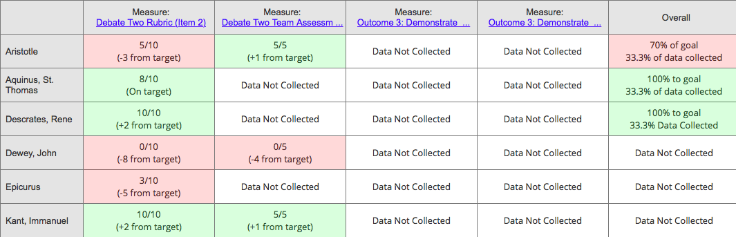
A concept illustrating a powerful new way to collect and display data.
Challenge
My company had two products: its large flagship product and a smaller product. A major strategic goal of the company was to merge the two. The problem was that no one was quite sure how to do this. There was neither a clear vision of what the end product should be, nor a strategy for how to get there. Sensing this void, another UX designer and I stepped up to create a vision through early conceptual design backed in a strong foundation of user research. This vision was presented to the CEO of the company and became the guiding strategy for the product merge.
My Roles
- Recruit for and conduct interviews with several types of users
- Craft surveys and analyze qualitative and quantitative data
- Create personas
- Sketch and wireframe early conceptual design to help executives understand our design direction
- Present to top company executives
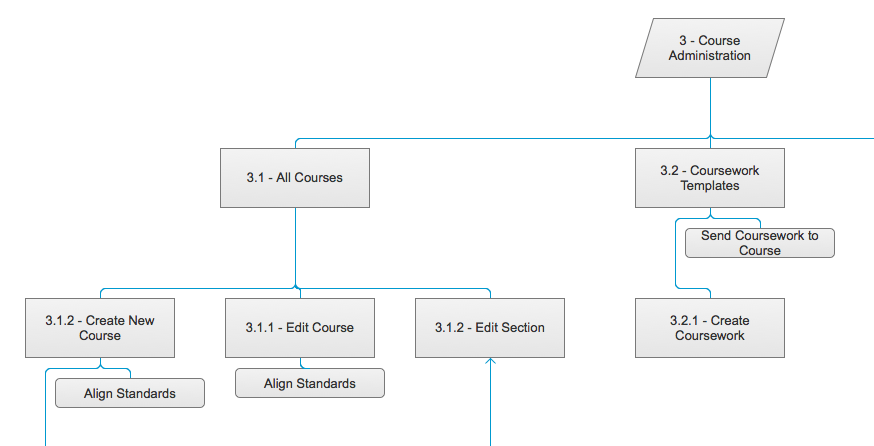
Wireframe
Master wireframe --
Master Sitemap
(email mjennex@gmail.com for password)
This wireframe document contains conceptual ideas for how we might accomplish problematic interactions, and how we might lay out large concepts like navigation and information architecture. It was not meant to be and never used as a design specification for development.
Process
Background and Recognizing the Problem
The company I was working for had two products in the same general market space, but with different purposes and aimed at different specific market segments. The two products had a lot of overlapping functionality, and the company recognized the business and technical value of combining these two products into one.
As our UX department was working on more immediate "just in time" problems, we kept deferring towards a vague future "combined" release. It was clear to everyone, UX, product managers, and development, that this release would address a multitude of small problems in both products.
Even though it was a part of the strategic vision of the company, no one really seemed to know what this combined release was going to look like. There was a vague feature list, but no strategic vision of what the final product should be. The more the UX team asked about this release, the more we realized that not much about it was known. This is when another UX designer and I began a user research project to help define the vision for this combined release.
Research, Triangulation, and Analysis
We started out small by scheduling a round of user interviews with some of our primary users. These were people we had reached out to and talked with before, and they not only provided us some great insights, but they helped us form an initial direction for our research that resulted in a more fleshed out research plan. We kept doing rounds of interviews, typically 3-5 a week, expanding to users we had never talked to, and into different segments of our user base. Around the middle of this process, we crafted and sent out a survey to users, gathering around 400 responses.
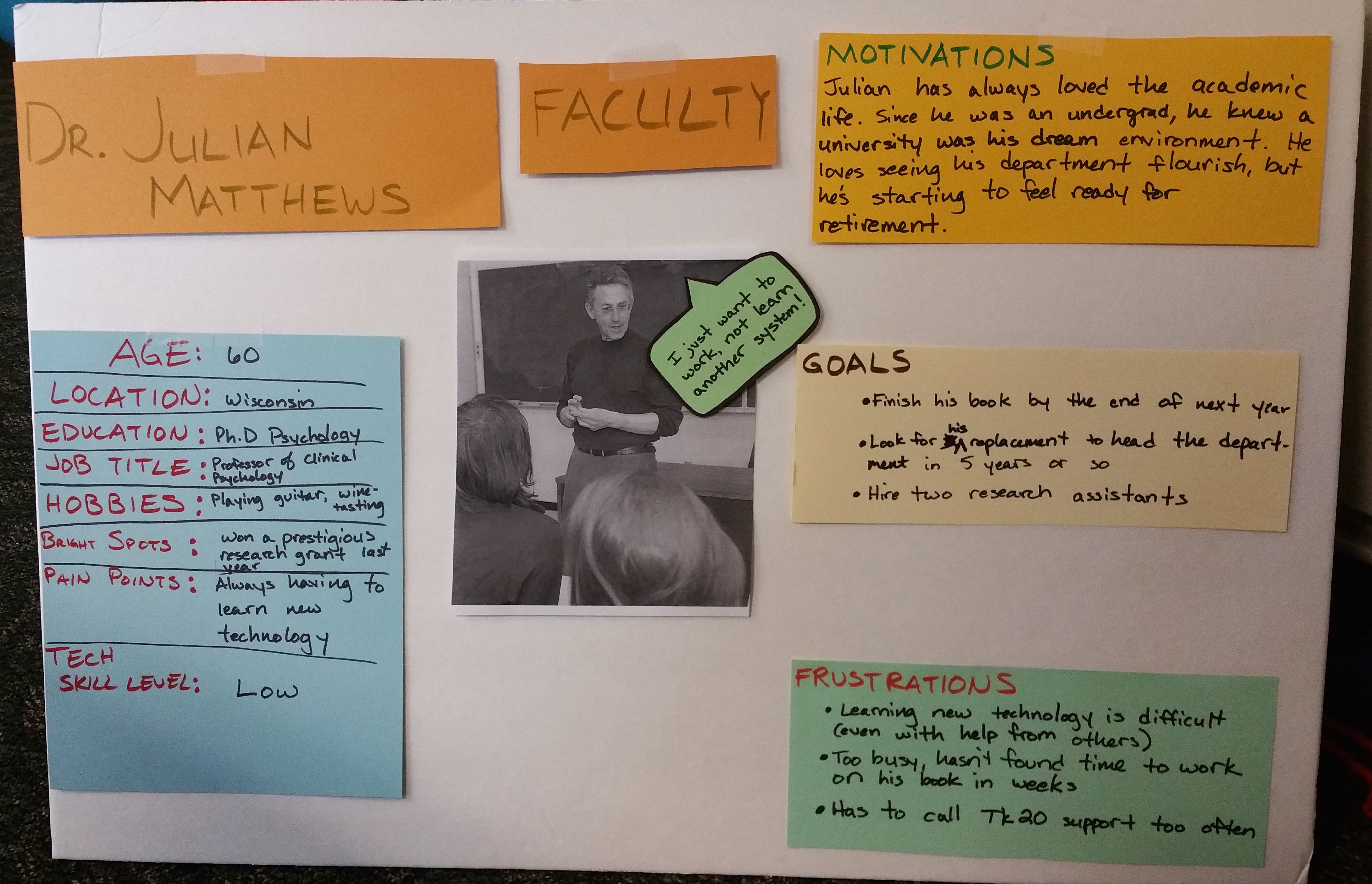
A persona, expressed as post-it notes on a foam core board.
Within a few months, we were faced with a mountain of raw data, and set about making sense of it all. We had previously written questions both in interview and survey form to be targeted towards either qualitative or quantitative analysis. We gathered the numbers on those quantitative responses and produced visuals to show statistical analysis. For the qualitative responses we grouped similar responses, looking for categories and affinities. This led us to identify pain points and bright spots to focus on.
We put all of our research together to form six personas representing four user groups, with two having sub groups. A vision for the combined system started to become more clear, and we had statistical evidence to support that vision. But, we knew the executives would want to visualize what we were saying, and so using our personas we sketched some simple workflows. We also mocked up some of the more tricky interactions, and conducted user testing to refine those interactions.
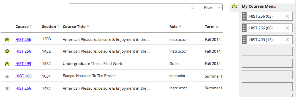
One of the tricky interactions we proposed for the release, and one that required many iterations and user testing. Here, a student is looking at a list of their courses and deciding which ones they want to appear on their "My Courses" menu.
Result
Armed with a vision, statistics, a wealth of quotes from actual users, sketches of workflows, and refined prototypes of trickier interactions, we went before the executive team with a presentation for how to do the combined release. Our months of research, preparation, concepting and ideation paid off, and the vision we presented became the strategy for the combined release.